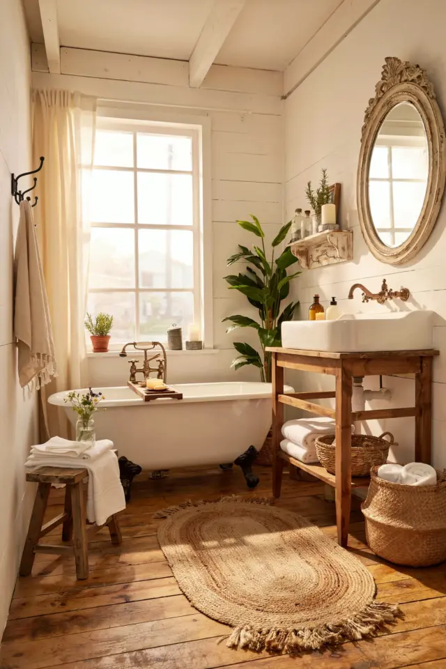
Why a Cohesive Home Color Scheme Matters for Beginners
If you have ever walked into a home where every room feels disconnected, you know the struggle. One room is bright white, the next is navy blue, and the hallway is a muddy beige. It does not feel peaceful. That is where whole house paint palettes come in. A curated palette ties your spaces together, creating a flow that makes your home feel larger, calmer, and intentional. You do not need to be a designer to get this right. The idea is simple: pick two or three main colors and a few accent shades, then repeat them throughout the house. This does not mean every room looks the same. It means the colors relate to each other, like a family of tones that naturally belong together.
For someone new to painting, starting with a consistent palette removes the guesswork. You avoid the dreaded paint store overwhelm where you stare at hundreds of swatches. Instead, you work from a short list of curated colors. This approach also saves money because you can buy larger quantities of the same paint and use leftovers for touch ups. The result is a home that feels collected, not chaotic. And the best part? You can still follow your personal style, whether that leans warm and earthy or cool and minimalist.
Choosing a Neutral Base for Your Whole House Palette
The foundation of any good palette is a neutral base. You will use this on most walls, ceilings, and large surfaces. Neutrals are not just white or beige. They include soft greiges, warm creams, and even very pale muted colors like a dusty blush or a faint sage. When choosing a neutral, look at the undertone. Is it pinkish, yellow, blue, or green? That undertone will influence every other color you pair it with. A warm cream (with yellow undertone) works beautifully with earth tones and gold accents. A cool greige (with blue undertone) pairs well with deep jewel tones like emerald or sapphire.
For beginners, I recommend sticking with one neutral for the main living areas. Test it in several rooms first, on different walls, at different times of day. Natural light shifts color dramatically. A soft warm white like “Swiss Coffee” by Benjamin Moore or “Alabaster” by Sherwin Williams are safe starting points. But do not be afraid to go slightly bolder with a warm mushroom color if you want more depth. The neutral should not scream for attention. It should sit quietly in the background, letting your furniture and accent colors shine.
Adding Depth with Jewel Tones and Warm Accents
Once your neutral base is set, you can add personality with richer colors. Jewel tones like deep teal, emerald green, amethyst purple, or rich sapphire blue are having a moment for a reason. They bring warmth and drama without feeling dark or oppressive, especially when used on a single accent wall, a trim, or furniture. For a whole house palette, you do not need to paint every room in a jewel tone. Instead, pick one or two colors and repeat them in different ways. A deep teal dining room wall, teal throw pillows in the living room, and a teal vase in the hallway create a thread that runs through the house.
Warm accents such as terra cotta, burnt orange, or ochre yellow also pair superbly with jewel tones. These colors add life and prevent the blue or green from feeling cold. If you are new to color, start small. Paint the back of a bookshelf in a jewel tone, or use it on the inside of a door frame. You can always go bigger later. The key is to keep the palette limited. Three main colors (neutral, one jewel tone, one warm accent) plus a few metallic touches is plenty for a cohesive look.
- Pick one neutral base (e.g., warm white or greige).
- Choose one to two jewel tones (e.g., deep teal or emerald green).
- Add one warm accent (e.g., terra cotta or mustard).
- Use gold or brass for fixtures and accessories.
- Test colors on large poster boards before committing.
How to Use Gold Accents Without Overdoing It
Gold accents are a staple in minimal interiors because they add a touch of luxury without clutter. But too much gold can look gaudy. The trick is to treat gold as a finishing spice, not the main ingredient. In a whole house palette, gold works best on hardware, light fixtures, mirror frames, and small decor pieces. Think cabinet knobs, faucets, lamp bases, and picture frames. Keep the finish consistent. Brushed brass feels soft and modern, while polished gold is more traditional. Pick one finish and use it throughout the house for a cohesive, polished look.
Gold also pairs beautifully with jewel tones. A navy blue wall with brass sconces feels elegant and warm. A soft cream room with a gold framed mirror feels airy yet grounded. Avoid painting large gold accents on walls (like stencils or stripes) unless you are very confident.
#WholeHousePaintPalettes #ColorHarmony #TimelessHome #MinimalInteriors #GoldAccents
Leave a Comment